
Color in Quilting
Guest blogger Sylvia Raschella is here to teach us alllll about using color in quilting… and she’s quite the expert! Not only is Sylvia a quilt pattern designer, but she’s a brand designer as well.

Hey there, I’m Sylvia! I’m a quilter, quilt pattern designer and a brand designer for quilters. I can’t remember a time when I wasn’t making or designing something and color was always my favorite part of the process. It’ always been fun to play with different color combinations in both my quilts and design work. And that’s just what I’m here to talk to you about, color in quilting and how to get the color in your fabric pull juuust right!
Picking fabric can be the most fun (or the most stressful) part of starting a new quilting project. Choosing fabric and colors that “go” together can be a tough decision for a lot of quilters, which leaves them reaching for quilt. kits, curated bundles or fabrics from the same collection (no shame in that!). Understanding how color works will give you confidence to get outside your comfort zone and explore different color combinations that you never thought about! The good news is that seeing color harmony can be a learned skill!
Color Theory
Let’s talk a little about color theory. Color theory is basically a set of guidelines for using color. It’s how colors interact and relate to each other and how humans perceive those interactions and relations. All colors communicate a message and feeling. The colors you choose for your quilt can create an impression of your personality as well as an emotional connection, and that’s a big part of what will make your quilt unique!
Types of Color
Colors (or hues) are categorized into 3 basic groups:

● Primary Colors: all colors come from at least one of these three hues
● Red, Yellow and Blue
● Secondary Colors: made by mixing any two primary colors
● Orange (red + yellow), Green (yellow + blue), and Purple (blue + red)
● Tertiary Colors: made by mixing primary and secondary colors
● Red-Orange, Yellow-Orange, Yellow-Green, Blue-Green, Blue-Purple, Red-Purple
Some other ways colors are categorized:

● Warm Colors: These are made from red, orange, yellow, and the combination of the colors together.
● Cool Colors: These are made from green, blue, purple, and the combination of the colors together.
Tip: Warm colors stand out, while cool colors blend into the background. You can play with what design elements you want to accentuate on your quilt by using warm and cool colors.
Tints, Shades & Tones

● Tint: Mixing white with a pure color
● Shade: Mixing black with a pure color
● Tone: Mixing both black and white with a pure color
Tip: Add a variety of tints, shades, and tones to your color palette to add depth and dimension to your project.
Basic Color Schemes

● Monochromatic: A color palette made from one color in varying values (light to dark).
● Analogous: A color palette using neighboring colors on the color wheel.
● Triadic: A color palette using 3 colors that are evenly spaced around the color wheel.
● Complementary: A color palette using colors that are opposite to one another on the color wheel.
● Split Complementary: A color palette using a color with its complementary color plus one or two colors adjacent to its complement.
● Double Split Complementary: A color palette using two pairs of complementary colors that form an X on the color wheel.
Basic Color Scheme Examples:

My Go-To Method
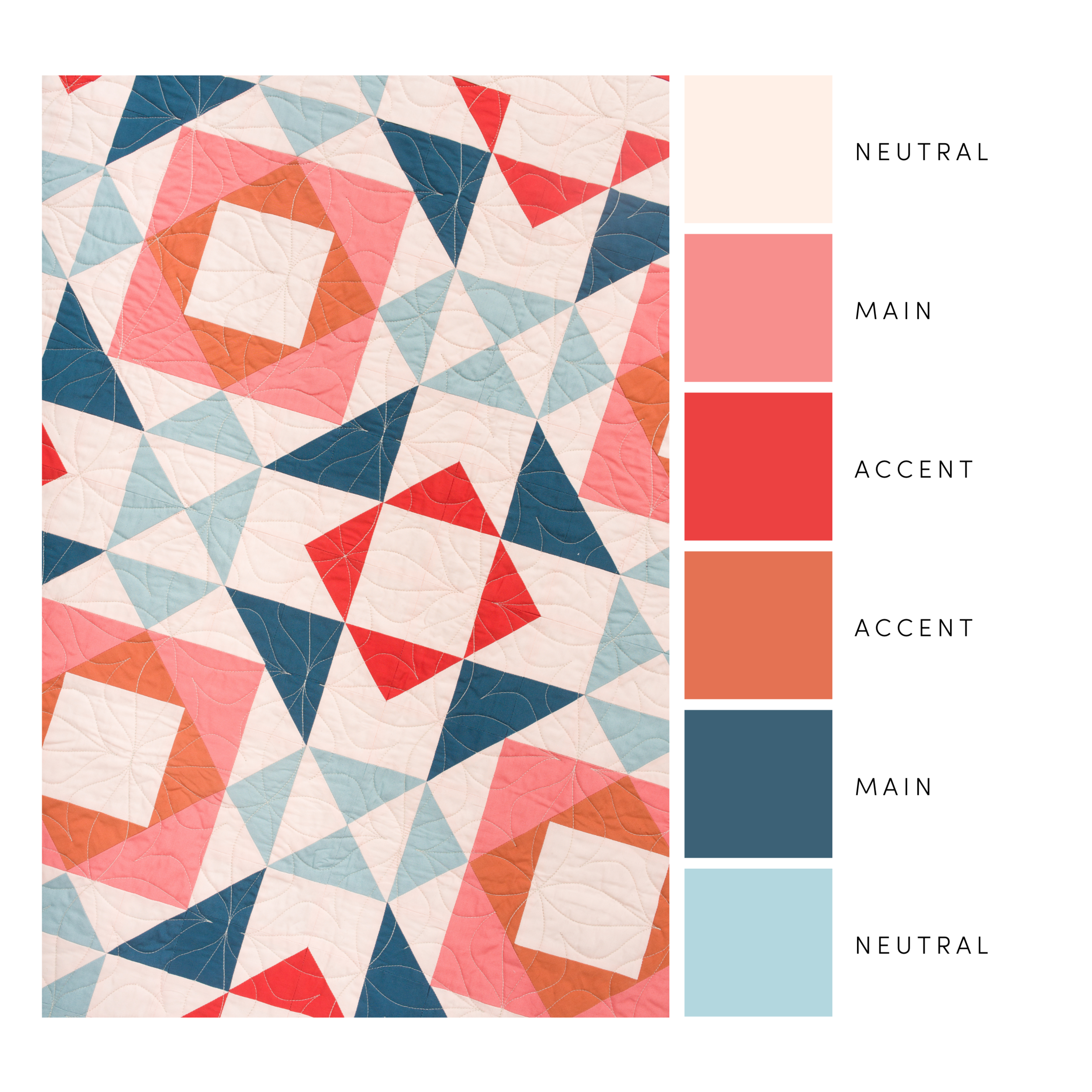
I’ve had a lot of practice playing with color in my years as a designer and quilter and feel confident relying on my intuition when putting a color palette together, but I noticed I tend to more or less follow a split complementary color scheme. I start with one color and choose a few shades, tints, and tones within that color family. Next, I determine the two split complementary colors from that color. One will be the supplementary color and the other will be the accent color. From the supplementary color family, I’ll choose a few shades, tints, and tones. From the accent color family, I choose 1-2 shades that stand out in contrast.
To balance out the color palette and make sure it has enough depth and dimension, I use the formula below. The amount of colors may vary depending on how many are needed for the quilt you are working on.
1-2 main colors + 2-3 neutral colors + 1-2 accent colors
Main colors: This would be the color(s) that you want to showcase and use the most of, in your quilt. Pick a color(s) that stands out from the background color and really makes the design in your quilt shine.
Neutral colors: These add balance to everything and are mostly used as your background fabric. Typical neutrals are blacks, grays, whites, and beiges, but don’t be afraid to mix it up a bit! They could be a color in a dark shade, light tint or low tone.
Accent colors: These should be playful colors that pack a punch and grab your attention. They add depth, dimension, and complement your main color(s).
Here’s a color palette example using my formula:
Tip: Be sure to add light, medium, and dark colors to your color palette to add balance and interest to your design.

Practice!
As I mentioned before, creating a balanced color palette is a learned skill, but the only way to learn and train your eye to see color harmony is to practice and to not be afraid to experiment. Get out of your comfort zone and play around with colors you usually don’t gravitate towards. Here are a few ways to practice and get inspired:
● Color Wheel: Color wheels are great to have when playing with your fabric stash. I recommend this physical color wheel or the free online color wheel from Adobe Color.
● Color Cards: Color cards are great for physically auditioning colors together for your fabric pull before committing to buying fabric! I love the ones from Woven and Woolly.
● Color Palette Accounts: Get color palette inspiration from accounts like The Color Catalog, Color Palette Cinema, and Coolors.
● Color Palette Generators: Get color palettes using your own pictures or images that inspire you with the Pantone Studio app or the Coolors website.
● Start a Pinterest Board or Saved Folder on Instagram: I have both! When I’m scrolling through either Pinterest or Instagram and I come across an inspiring color palette, I save it for later!
The more you practice using a color wheel, notice color around you, and play with your own color palettes, the stronger your intuition and eye for color will get. Remember, how you see color is 100% unique. Whatever makes you excited when you put colors together, lean into it!